Documentation
Everything you need to build and customize your guns.lol profile page.
Like this project? Visit my profile on guns.lol/500 or sexcaller.lol — drop a view, it helps a lot.
Disclaimer: This is a fan-made clone of a guns.lol profile page. It is missing many features and layouts from the real site. I am not responsible for what you do with this code. Build on it, extend it, break it — it's yours now.
What is this?
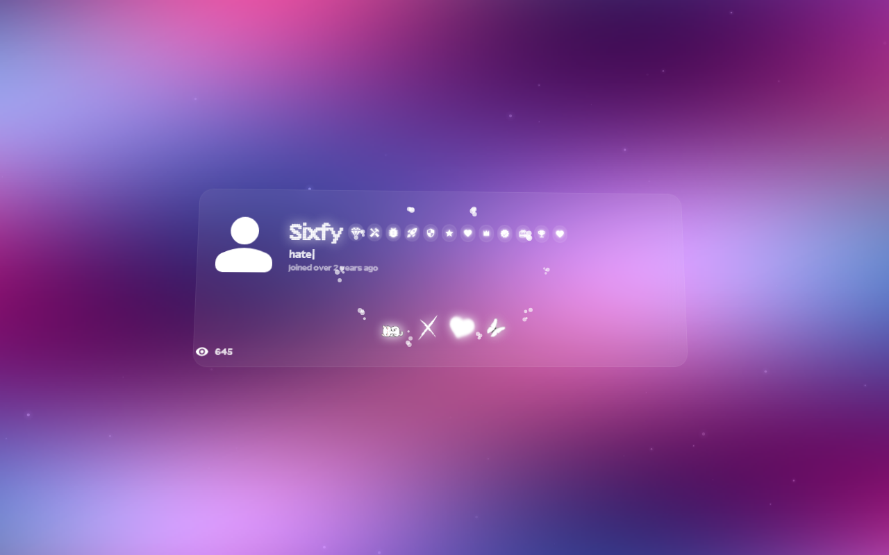
A fully customizable guns.lol profile page clone built with vanilla HTML, CSS, and JavaScript. No frameworks, no build tools. Everything controlled from src/js/config.js.
Zero server required. Edit config.js, refresh the browser, see changes instantly.
Features
Quick Start
From zero to a fully customized profile in under two minutes.
No build step, no npm install, no server required. Edit a config file, refresh the browser, see changes instantly.
1. Get the project
Clone or download the repository. The project is a flat file structure — no framework, no bundler.
git clone https://github.com/6sfy/guns.lol.git
cd guns.lol
2. Open the config file
All configuration lives in src/js/config.js. Open it in any text editor.
3. Set your identity
Change the display name and user ID to your own.
const CONFIG = {
  username: "YourName",
  uid: "12,345",
  joinedDate: "Joined 3 months ago",
  // ...
};
4. Add badges
Badges appear beneath your avatar. Just use the icon key — color and name are automatic.
badges: ["verified", "premium"],5. Add links
Each link gets an icon image and a shadow color.
links: [
  { url: "https://github.com/YourName", icon: "src/assets/icons/icon.png", color: "#ffffff" },
],
6. Choose a layout and theme
layout: { type: "glass", containerWidth: "44rem" },
theme: { preset: "dark" },
7. Open in browser
Open index.html in your browser (double-click or drag into a browser window).
If you're already editing, just hit Ctrl+R / Cmd+R to see changes.
Pro tip: Use a live-reload server like bunx serve or VS Code's Live Server extension for instant refresh on save.
Minimal working config
This is the smallest config that produces a working profile page.
const CONFIG = {
  username: "YourName",
  uid: "12,345",
  splash: { text: "hello", fontSize: "34px" },
  avatar: { type: "icon" },
  bio: { typewriter: false, staticBio: "Just vibing." },
  joinedDate: "Joined 3 months ago",
  badges: [],
  links: [],
  views: 0,
  layout: { type: "default", containerWidth: "44rem" },
  theme: { preset: "dark" },
  background: { color: "#000000", effects: {} },
};Project Structure
How the project is organized and how it works.
guns.lol/
├── index.html              # Entry point — open this in your browser
├── src/
│   ├── js/
│   │   ├── config.js   # ★ Your configuration file
│   │   └── main.js     # Application logic and rendering
│   ├── css/
│   │   └── style.css   # Profile page styles
│   └── assets/     # Images, icons, cursors, fonts
│       ├── avatar/
│       ├── cursor/
│       └── icons/
└── docs/                    # Documentation site (you are here)
How it works
index.htmlloadsconfig.jsfirst, which defines theCONFIGobject globallymain.jsreadsCONFIG, generates CSS custom properties, builds the HTML structure, and initializes effects- All rendering is purely client-side — no server, no API, no database
- Edit
config.js, refresh the browser, see changes instantly
Important: config.js must load before main.js in the HTML. The default file already handles this correctly.
Configuration Overview
Every top-level property in the CONFIG object at a glance.
The entire profile is controlled by a single CONFIG object in src/js/config.js. Every feature is optional — leave fields at their default, set values to false, or use empty arrays to disable anything.
Here is the actual config.js with all default values — use it as your starting template:
const CONFIG = {
  username: "Sixfy",
  uid: "20,028",
  splash: { text: "guns.lol", fontSize: "34px", fontFamily: "", fontWeight: "500", color: "" },
  avatar: { type: "icon" },
  bio: { typewriter: true, texts: ["love", "sex", "hate", "disgust"], staticBio: "disgust", typeSpeed: 80, deleteSpeed: 50, pauseDuration: 2000 },
  joinedDate: "Joined over 2 years ago",
  badges: ["premium"],
  links: [{ url: "https://example.com", icon: "src/assets/icons/icon.png", color: "#ffffff" }],
  views: 644,
  audio: { src: "", title: "Another One", artist: "DJ Khaled", autoplay: true, loop: true, volume: 0.3, showControls: false, playlist: [] },
  volumeControl: { enabled: false, position: "top-left" },
  progressBar: { height: 3, radius: 15, color: "#ffffff", bgColor: "rgba(255,255,255,0.3)", thumbSize: 10, gradient: [] },
  cursor: { enabled: true, src: "src/assets/cursor/cursor.png", hotspotX: 16, hotspotY: 16 },
  mouseEffect: { enabled: true, variant: "particles", color: "#ffffff" },
  card3d: { enabled: true, intensity: 8, perspective: 1000 },
  fonts: { enabled: true, families: ["Array", "Onest"], importUrl: "" },
  shuffleText: { enabled: false, text: "SIXFY", fontFamily: "Press Start 2P", fontSize: "4rem" },
  layout: { type: "glass", containerWidth: "44rem", containerPadding: "26px", containerRadius: "20px" },
  location: { enabled: false, text: "guns.lol HQ", timezone: "Europe/Berlin" },
  about: { enabled: false, text: "Hi. I own guns.lol." },
  portfolio: { enabled: false, skills: ["Python", "JavaScript"], projects: [{ name: "guns.lol", description: "Create feature-rich, customizable and modern link-in-bio pages.", url: "https://guns.lol" }] },
  theme: { preset: "", textColor: "#ffffff", backgroundColor: "#000000", glowColor: "#ffffff", usernameEffects: "", containerColor: "rgba(255,255,255,0)", containerBlur: "0px", containerBorderWidth: "2px", containerBorderColor: "rgba(200,130,255,0.5)", selectionBg: "#ffffff", selectionColor: "#000000", buttonBg: "rgba(255,255,255,0.22)", buttonBgHover: "rgba(255,255,255,0.32)", buttonBorder: "2px solid rgba(255,255,255,0.12)", buttonRadius: "12px", volumeBg: "rgba(255,255,255,0.2)", volumeBorder: "2px solid rgba(255,255,255,0.05)" },
  background: { src: "", color: "#000000", effects: { aurora: true, dither: false, plasma: false, snow: false, rain: false, stars: true, fireflies: false } },
};
Top-level properties
| Property | Type | Default | Description |
|---|---|---|---|
username | string | "Sixfy" | Display name at the top |
uid | string | "20,028" | User ID in hover tooltip |
splash | object | — | Overlay text and styling |
avatar | object | — | Icon or image avatar |
bio | object | — | Static or typewriter bio |
joinedDate | string | "Joined over 2 years ago" | Join date text |
badges | array | [] | Badge icon definitions |
links | array | [] | Social/URL link buttons |
views | number | 644 | Initial view count display |
audio | object | — | Audio player settings |
volumeControl | object | — | Floating volume slider |
progressBar | object | — | Audio seek bar style |
cursor | object | — | Custom cursor image |
mouseEffect | object | — | Mouse trail / particles / glow / ripple |
card3d | object | — | 3D perspective tilt on hover |
fonts | object | — | Custom font families |
shuffleText | object | — | Matrix-style text scramble |
layout | object | — | Layout preset and dimensions |
location | object | — | Location pin with live clock |
about | object | — | Personal text section |
portfolio | object | — | Skills and projects showcase |
theme | object | — | Colors, fonts, button styles |
background | object | — | Color, image, canvas effects |
Profile
Your display name, avatar, splash overlay, and join date.
These fields control the identity section at the top of your profile — the username, avatar, splash text overlay, and join date stamp.
Fields
| Field | Type | Default | Description |
|---|---|---|---|
username | string | "Sixfy" | Display name shown at the top of the profile |
uid | string | "20,028" | User ID displayed in hover tooltip |
joinedDate | string | "Joined over 2 years ago" | Join date stamp shown below badges. Set to empty string to hide. |
splash | object | — | Text overlay displayed across the profile |
avatar | object | — | Avatar type and source |
Splash
| Field | Type | Default | Description |
|---|---|---|---|
text | string | "" | Overlay text. Empty string hides it. |
fontSize | string | "34px" | CSS font size value |
fontFamily | string | "" | CSS font family. Empty = inherits profile font. |
fontWeight | string | "500" | CSS font weight |
color | string | "" | Text color. Empty = inherits theme text color. |
splash: {
  text: "guns.lol",
  fontSize: "34px",
  fontFamily: "",
  fontWeight: "500",
  color: "",
},
Avatar
| Field | Type | Default | Description |
|---|---|---|---|
type | string | "icon" | "icon" uses a generated icon. "image" uses a custom image. |
src | string | "" | Required when type: "image". Path to the avatar image. |
// Icon mode (default)
avatar: { type: "icon" },

// Custom image mode
avatar: { type: "image", src: "src/assets/avatar/example.png" },
Joined Date
A simple text string. Set to empty to hide the element entirely.
joinedDate: "Joined over 2 years ago",Badges
12 built-in badge icons with tooltips and custom colors.
Badges appear in a row beneath your avatar. Each badge shows an icon with a color tint and displays the badge name in a tooltip on hover.
Badge fields
| Field | Type | Default | Description |
|---|---|---|---|
name | string | auto | Displayed on hover. Auto-derived from icon key if omitted. |
icon | string | — | Key from the BADGE_SVGS map (see below) |
color | string | auto | Auto-pulled from BADGE_DEFAULT_COLORS by name. Override with any CSS color. |
monochrome | boolean | false | If true, forces white icon with white glow regardless of color |
You can use just the icon key as a string — name and color are filled automatically:
badges: ["verified", "premium", "booster"],Or use the full object format for custom names/colors:
badges: [
  { name: "Custom Badge", icon: "star", color: "#ff4500" },
],
Available icons
The icon keys map to inline SVG paths in BADGE_SVGS defined in config.js. You can add custom icons by extending the map.
Bio & Typewriter
A static bio line or an animated typewriter that cycles through multiple texts.
The bio sits below your badges. Choose between a static text line or an animated typewriter that types, pauses, deletes, and repeats through a list of phrases.
Fields
| Field | Type | Default | Description |
|---|---|---|---|
typewriter | boolean | true | Enable animated typewriter. false = static mode. |
texts | string[] | ["love","sex","hate","disgust"] | Phrases to cycle through (typewriter mode only) |
staticBio | string | "disgust" | Static text shown when typewriter: false |
typeSpeed | number | 80 | Milliseconds per character when typing |
deleteSpeed | number | 50 | Milliseconds per character when deleting |
pauseDuration | number | 2000 | Milliseconds to pause after typing a phrase |
bio: {
  typewriter: true,
  texts: ["love", "sex", "hate", "disgust"],
  staticBio: "disgust",
  typeSpeed: 80,
  deleteSpeed: 50,
  pauseDuration: 2000,
},
How it works
- First phrase types out, one character at a time (
typeSpeeddelay per char) - Pauses for
pauseDurationms - Deletes each character (
deleteSpeeddelay per char) - Moves to the next phrase and repeats
- After the last phrase, loops back to the first
Static mode
Set typewriter: false. The staticBio value renders as plain text with no animation.
bio: {
  typewriter: false,
  staticBio: "Just vibing.",
},Links
Social and external link buttons with custom icons.
Each link renders as a circular button with an icon image. Clicking opens the URL in a new tab. Links appear in a row beneath the bio.
Link fields
| Field | Type | Default | Description |
|---|---|---|---|
url | string | — | Link destination. Opens in a new tab. |
icon | string | — | Path to the icon image (PNG, GIF, WebP, SVG) |
color | string | "" | Drop shadow color for the icon image |
links: [
  { url: "https://github.com/6sfy", icon: "src/assets/icons/github.webp", color: "#ffffff" },
  { url: "https://instagram.com/izayvss", icon: "src/assets/icons/insta.webp", color: "#ffffff" },
],
Use square icon images (ideally 64x64 or larger). The button crops them into a circle and applies the color value as a CSS drop-shadow filter.
Audio Player
Inline music player with playlist, volume control, and progress bar.
The audio player sits inside the profile container. It supports a single track or a playlist, autoplay, looping, a draggable progress bar, and an optional volume slider.
Audio fields
| Field | Type | Default | Description |
|---|---|---|---|
src | string | "" | URL to the audio file (MP3, OGG, WAV) |
title | string | "Another One" | Track title shown in the player |
artist | string | "DJ Khaled" | Artist name shown below the title |
autoplay | boolean | true | Start playing automatically when the page loads |
loop | boolean | true | Repeat the track/playlist when it ends |
volume | number | 0.3 | Initial volume (0.0 to 1.0) |
showControls | boolean | false | Show native browser audio controls |
playlist | array | [] | Additional tracks to queue (see playlist format below) |
audio: {
  src: "https://example.com/track.mp3",
  title: "My Track",
  artist: "Artist Name",
  autoplay: true,
  loop: true,
  volume: 0.3,
  showControls: false,
  playlist: [],
},
Playlist
Each playlist entry has the same shape as the main track. Tracks play in order and loop when the playlist ends.
| Field | Type | Description |
|---|---|---|
src | string | URL to the audio file |
title | string | Track title |
artist | string | Artist name |
playlist: [
  { src: "track1.mp3", title: "Song 1", artist: "Artist 1" },
  { src: "track2.mp3", title: "Song 2", artist: "Artist 2" },
],
Volume Control
A floating volume knob positioned relative to the profile container.
| Field | Type | Default | Description |
|---|---|---|---|
enabled | boolean | false | Show the volume slider |
position | string | "top-left" | Corner: "top-left", "top-right", "bottom-left", "bottom-right" |
volumeControl: {
  enabled: true,
  position: "top-left",
},
Progress Bar
Customizable audio seek bar below the track info.
| Field | Type | Default | Description |
|---|---|---|---|
height | number | 3 | Bar height in pixels |
radius | number | 15 | Border radius in pixels |
color | string | "#ffffff" | Progress fill color |
bgColor | string | "rgba(255,255,255,0.3)" | Track background color |
thumbSize | number | 10 | Draggable thumb diameter in pixels |
gradient | array | [] | Gradient color stops. Overrides color if set. Format: ["#ff0000", "#00ff00"] |
progressBar: {
  height: 3,
  radius: 15,
  color: "#ffffff",
  bgColor: "rgba(255,255,255,0.3)",
  thumbSize: 10,
  gradient: [],
},Layouts
5 layout presets that control the overall structure and visual style.
The layout determines how your profile content is arranged — avatar position, container styling, spacing, and borders. Switch between presets with a single string.
Fields
| Field | Type | Default | Description |
|---|---|---|---|
type | string | "glass" | Layout preset key (see presets below) |
containerWidth | string | "44rem" | Max width of the profile container |
containerPadding | string | "26px" | Inner padding of the profile container |
containerRadius | string | "20px" | Border radius of the profile container |
layout: {
  type: "glass",
  containerWidth: "44rem",
  containerPadding: "26px",
  containerRadius: "20px",
},
Layout presets
| Preset | Avatar | Style |
|---|---|---|
default | Left | Standard bordered container with visible background |
stacked | Top, centered | Same as default but avatar and content stack vertically |
compact | Left | Smaller spacing and typography for a tighter feel |
minimal | Left | Transparent container, no border, content floats on background |
glass | Left | Glassmorphism — translucent container with backdrop blur |
Theme
Colors, fonts, container styling, and button appearance.
The theme controls every visual color on the page — text, background, container, buttons, selection highlight, and glow effects. You can use a preset or set every value manually.
Theme fields
| Field | Type | Default | Description |
|---|---|---|---|
preset | string | "" | Preset name: "dark", "light", "neon", "ocean", or empty for manual |
textColor | string | "#ffffff" | Primary text color |
backgroundColor | string | "#000000" | Page background color |
glowColor | string | "#ffffff" | Color used for glow/shadow effects |
usernameEffects | string | "" | URL to a GIF applied as a mask/background on the username text |
containerColor | string | "rgba(255,255,255,0)" | Profile container background |
containerBlur | string | "0px" | Backdrop blur on the container (glass effect) |
containerBorderWidth | string | "2px" | Container border width |
containerBorderColor | string | "rgba(200,130,255,0.5)" | Container border color |
selectionBg | string | "#ffffff" | Text selection background color |
selectionColor | string | "#000000" | Text selection text color |
buttonBg | string | "rgba(255,255,255,0.22)" | Link button background |
buttonBgHover | string | "rgba(255,255,255,0.32)" | Link button background on hover |
buttonBorder | string | "2px solid rgba(255,255,255,0.12)" | Link button border |
buttonRadius | string | "12px" | Link button border radius |
volumeBg | string | "rgba(255,255,255,0.2)" | Volume slider background |
volumeBorder | string | "2px solid rgba(255,255,255,0.05)" | Volume slider border |
theme: {
  preset: "",
  textColor: "#ffffff",
  backgroundColor: "#000000",
  glowColor: "#ffffff",
  usernameEffects: "",
  containerColor: "rgba(255, 255, 255, 0)",
  containerBlur: "0px",
  containerBorderWidth: "2px",
  containerBorderColor: "rgba(200, 130, 255, 0.5)",
  selectionBg: "#ffffff",
  selectionColor: "#000000",
  buttonBg: "rgba(255, 255, 255, 0.22)",
  buttonBgHover: "rgba(255, 255, 255, 0.32)",
  buttonBorder: "2px solid rgba(255, 255, 255, 0.12)",
  buttonRadius: "12px",
  volumeBg: "rgba(255, 255, 255, 0.2)",
  volumeBorder: "2px solid rgba(255, 255, 255, 0.05)",
},
Theme presets
Set preset to one of these to auto-fill all theme values. Leave empty to define everything manually.
| Preset | Vibe |
|---|---|
"dark" | Black background, white text, purple container border |
"light" | White background, dark text, light borders |
"neon" | Dark background with bright cyan/magenta accents |
"ocean" | Dark blue background with teal and cyan tones |
Fonts
Custom font families loaded via @import or Google Fonts.
| Field | Type | Default | Description |
|---|---|---|---|
enabled | boolean | true | Enable custom fonts |
families | string[] | ["Array","Onest"] | Font family names in priority order |
importUrl | string | "" | Optional @import URL for the font (Google Fonts, etc.) |
fonts: {
  enabled: true,
  families: ["Array", "Onest"],
  importUrl: "",
},Background
Color, image, and animated canvas effects that run behind your profile.
The background fills the full viewport behind the profile container. You can set a solid color, an image via URL, and layer up to 7 canvas-based effects on top.
Fields
| Field | Type | Default | Description |
|---|---|---|---|
src | string | "" | Background image URL. Empty = no image. |
color | string | "#000000" | Solid background color (visible behind effects) |
effects | object | — | Toggle canvas effects on/off |
background: {
  src: "",
  color: "#000000",
  effects: { aurora: true, dither: false, plasma: false, snow: false, rain: false, stars: true, fireflies: false },
},
Available effects
| Effect | Description | Performance |
|---|---|---|
aurora | Slowly shifting aurora borealis with multiple colored bands | Medium |
stars | Scrolling star field with parallax depth layers | Light |
snow | Falling snowflakes with varying size and speed | Light |
rain | Rain streaks falling diagonally | Light |
plasma | Animated plasma color swirls | Heavy |
fireflies | Small glowing particles floating with organic motion | Medium |
dither | Dithering noise overlay for a retro/vaporwave look | Light |
Multiple effects can impact performance, especially on low-end devices. The page auto-detects hardware capability and scales down effects when needed. Disable effects you don't need to keep things smooth.
Mouse Effects
4 visual feedback effects that respond to cursor movement and clicks.
A canvas-based effect that follows or reacts to your mouse. Choose from trail, particles, glow, or ripple variants. Only one variant can be active at a time.
Fields
| Field | Type | Default | Description |
|---|---|---|---|
enabled | boolean | true | Enable the mouse effect |
variant | string | "particles" | Effect type: "trail", "particles", "glow", or "ripple" |
color | string | "#ffffff" | Color of the effect elements |
mouseEffect: {
  enabled: true,
  variant: "particles",
  color: "#ffffff",
},
Variants
| Variant | Behavior |
|---|---|
trail | Fading circles follow behind the cursor like a comet tail |
particles | Velocity-based particle bursts — faster movement emits more particles in 360° spread |
glow | Soft radial gradient glow that follows the cursor |
ripple | Expanding ring ripples emit on click |
Performance: particles is the heaviest variant. The page auto-limits particle count on low-end devices. Switch to trail or glow for better performance.
3D Card Tilt
Interactive perspective tilt that follows mouse position over the profile card.
The profile container rotates in 3D space based on the mouse position relative to its center. Creates a physical, dimensional feel — like holding a card and tilting it toward the light.
Fields
| Field | Type | Default | Description |
|---|---|---|---|
enabled | boolean | true | Enable 3D tilt |
intensity | number | 8 | Maximum tilt angle in degrees. Higher = more dramatic rotation. |
perspective | number | 1000 | CSS perspective value in pixels. Lower = stronger depth distortion. |
card3d: {
  enabled: true,
  intensity: 8,
  perspective: 1000,
},
Try intensity: 15 with perspective: 600 for a more exaggerated tilt. Lower intensity to 3 for a subtle, premium feel.
Custom Cursor
Replace the system cursor with a custom image.
Hides the browser's default cursor and uses a PNG image instead. Applies to the entire page.
Fields
| Field | Type | Default | Description |
|---|---|---|---|
enabled | boolean | true | Enable custom cursor |
src | string | "" | Path to a PNG cursor image |
hotspotX | number | 16 | X coordinate of the click hotspot (pixels from left) |
hotspotY | number | 16 | Y coordinate of the click hotspot (pixels from top) |
cursor: {
  enabled: true,
  src: "src/assets/cursor/cursor.png",
  hotspotX: 16,
  hotspotY: 16,
},
For a centered cursor (like crosshair), set hotspot to half the image dimensions. For a pointer tip cursor, set hotspot near the top-left (e.g., hotspotX: 2, hotspotY: 2).
Shuffle Text
Matrix-style character scramble animation on the username.
The username text cycles through random letters before settling on the final value. Creates a hacker/matrix aesthetic. Works best with a monospace or pixel font.
Fields
| Field | Type | Default | Description |
|---|---|---|---|
enabled | boolean | false | Enable shuffle animation on page load |
text | string | "SIXFY" | The text to animate (overrides username for this effect) |
fontFamily | string | "Press Start 2P" | Font used during the shuffle animation |
fontSize | string | "4rem" | Font size during the animation |
shuffleText: {
  enabled: true,
  text: "SIXFY",
  fontFamily: "Press Start 2P",
  fontSize: "4rem",
},
The shuffle effect only runs once on page load. After settling, the username displays normally using the profile's configured font.
Particle System
Velocity-based particle engine used by the mouse particles variant.
The particle system powers the particles variant of Mouse Effects. It's a real-time particle engine with gravity, friction, and velocity response — faster mouse movement produces more particles.
Behavior
- Velocity response: Moving the mouse faster emits more particles. Slow movement produces fewer, larger particles.
- 360° spread: Particles emit in all directions from the cursor position.
- Gravity & friction: Particles arc downward with simulated gravity and gradually slow down before fading out.
- Auto-scaling: Low-end devices get fewer max particles to maintain frame rate.
- Customizable color: Set via
mouseEffect.colorin the config.
mouseEffect: {
  enabled: true,
  variant: "particles",
  color: "#a749dd",
},
Configure the particle system via the Mouse Effects section. The particle variant is selected by variant: "particles".
Location
A location pin with live timezone clock.
Shows a pin icon with a location label and a live digital clock that updates every second based on the configured timezone.
Fields
| Field | Type | Default | Description |
|---|---|---|---|
enabled | boolean | false | Show the location section |
text | string | "guns.lol HQ" | Location label text (e.g., city name or "Remote") |
timezone | string | "Europe/Berlin" | IANA timezone identifier for the live clock |
location: {
  enabled: true,
  text: "guns.lol HQ",
  timezone: "Europe/Berlin",
},
Timezone uses IANA format (e.g. "America/New_York", "Asia/Tokyo"). The clock updates every second using the browser's Intl.DateTimeFormat.
About
A short text section for a personal message or tagline.
Displays a block of text beneath your profile. Great for a short bio, tagline, or description.
Fields
| Field | Type | Default | Description |
|---|---|---|---|
enabled | boolean | false | Show the about section |
text | string | "Hi. I own guns.lol." | About text content |
about: { enabled: true, text: "Hi. I own guns.lol." },Portfolio
A skills and projects showcase section.
Displays your skills as tags and your projects as clickable cards. Each project links to its URL in a new tab.
Portfolio fields
| Field | Type | Default | Description |
|---|---|---|---|
enabled | boolean | false | Show the portfolio section |
skills | string[] | ["Python","JavaScript"] | List of skill names displayed as tags |
projects | array | — | List of project entries (see below) |
Project entry
| Field | Type | Description |
|---|---|---|
name | string | Project display name |
description | string | Short project description |
url | string | Project link (opens in new tab) |
portfolio: {
  enabled: true,
  skills: ["Python", "JavaScript", "TypeScript"],
  projects: [
    {
      name: "guns.lol",
      description: "Create feature-rich, customizable link-in-bio pages.",
      url: "https://guns.lol",
    },
  ],
},Troubleshooting
Common issues and how to fix them.
Blank page / nothing shows
- Make sure
src/js/config.jsloads beforemain.jsin the HTML - Check the browser console (F12) for JavaScript errors
- Verify
CONFIGis defined and valid — missing commas or brackets will break the script
The HTML already has the correct script order. If you restructured the files, make sure config.js loads before main.js.
Effects not working
- Effects require
enabled: truein their config object - Background canvas effects stop if hardware acceleration is disabled in browser settings
Images not loading
- Use relative paths from
index.html, not from the config file location - Check that file paths exist and extensions match (case-sensitive on some servers)
- Link icon images should be ~64x64px for best appearance
Audio not playing
- Browsers block
autoplayuntil the user interacts with the page. Click anywhere first. - Use a direct MP3 URL (not a streaming page or playlist link)
- Check that the audio file supports CORS if hosted on a different domain
Performance issues
- Disable background effects you don't need —
plasmais the heaviest - Use
trailorglowmouse effects instead ofparticleson low-end devices - The page auto-detects low-end hardware and scales effects, but manual tuning helps
Config not applying
- Refresh the page (hard refresh: Ctrl+Shift+R / Cmd+Shift+R)
- Check for JSON syntax errors in the config file
- Some config changes (layout, theme) restructure the DOM — a full refresh may be needed
Layout looks wrong / card broken
- The
card3deffect can clash with custom layouts — try settingcard3d.enabled: falseif the card container looks shifted or clipped - Make sure
containerWidthisn't too narrow for your content (minimum ~32rem on desktop) - The
glasslayout requirescontainerBlurto be set (default0pxdisables the glass effect entirely) - If the card overflows on mobile, set
containerPaddinglower (e.g.,16px)
Fonts not showing
- Custom fonts require an active internet connection for the first load (they're loaded live from Google Fonts or external URLs)
- If using
importUrl, make sure it's a valid CSS@importURL (e.g.,https://fonts.googleapis.com/css2?family=...) - Font names in
familiesmust match exactly what the imported stylesheet declares — check for typos or missing spaces - Set
fonts.enabled: falseif you want to fall back to the system font stack
Shuffle text not animating
shuffleText.enabledmust betrue(it'sfalseby default)- The animation runs once on page load and then settles — you won't see it again until you hard refresh
- It requires a font that supports the characters you're using; try
Press Start 2Por another monospace/pixel font - The effect overrides the username during the animation — if
usernameis too long, the shuffle may look cut off with the default font size
Custom cursor not showing
- Verify
cursor.enabled: trueand a validsrcpath to a PNG file - The path is relative to
index.html, not toconfig.js - Some browsers disable custom cursors in certain UI elements (form inputs, iframes) — this is normal
- PNG with transparency works best; avoid JPEG or BMP
- If the cursor appears tiny or giant, adjust
hotspotXandhotspotYto match the image dimensions
3D card tilt not working
- Make sure
card3d.enabled: true - The tilt only activates on devices with a mouse — touch devices don't trigger hover, so the effect stays flat
- If the card jumps or glitches on hover, lower
intensity(try4) or raiseperspective(try1500) - Some layouts (
minimal) may needcard3ddisabled to keep the transparent container stable
Splash text not appearing
- Set
splash.textto a non-empty string — empty string hides the splash entirely - The splash renders above the profile card; if
fontSizeis too large, it may overflow or be clipped by the viewport - If
splash.coloris empty, it inheritstheme.textColor— if both end up matching the background, it's invisible
Links not opening
- Each link needs a valid
urlincluding the protocol (https://). Relative paths like/pagewon't work unless hosted on a server - The icon
colorfield only affects the drop-shadow filter — it won't break the link if missing - Check the browser console for errors — the link opens in a new tab via
window.open
Badge not showing correct color / tooltip
- String shorthand badges (e.g.,
"premium") auto-resolve name, color, and SVG from built-in maps — if the key doesn't exist inBADGE_SVGS, nothing renders - For custom badges, use the full object format with
name,icon,color - Tooltips are driven by the
namefield — if it's missing, the tooltip is empty - Badge SVGs are inlined in
config.js— you can add new icons by extending theBADGE_SVGSmap
Volume control not visible
volumeControl.enabledmust betrue- The volume slider is positioned outside the profile container at one of four corners — make sure there's enough viewport space around the card
- The
positionvalue is relative to the profile container, not the page. If the container is near the viewport edge, the slider may be partially off-screen
Container not centered / wrong width
containerWidthsets the max-width — on very wide screens the container stays centered viamargin: 0 auto- If the container sticks to the left, check that
index.htmlhasn't had its centering CSS removed - On mobile, the container fills the full width regardless of
containerWidth— this is intentional for small screens - Set
containerWidthin rem or px — percentage values like90%are not tested and may behave unpredictably
Background image not showing with effects
- The
background.srcimage sits behind the canvas effects — if effects are opaque (e.g.,aurorafills the whole canvas), you won't see the image - Disable opaque effects or set
colorto match the dominant color of your image so the transition between image and effects is seamless - The image is set as
background-imageon the page body — use a URL that supports CORS if externally hosted
Avatar not showing
- If
avatar.typeis"image",avatar.srcmust point to a valid image file — otherwise nothing renders (no fallback icon) - The path is relative to
index.html, not toconfig.js - Use
avatar.type: "icon"to fall back to a generated avatar icon based on the username's first letter - Square images work best — the avatar is displayed in a fixed-size circle with
object-fit: cover
Typewriter bio stuck / not cycling
bio.typewritermust betrue— if it'sfalse, it shows static text onlybio.textsneeds at least 2 entries for the cycling to be noticeable (with 1 entry it types once and pauses forever)- Check
typeSpeedanddeleteSpeed— extremely high values (e.g.,5000) make the animation appear frozen - The cursor blinking is part of the typewriter element — if the cursor is missing but text appears, verify the CSS
.typing-cursorclass isn't overridden
Complete Config Example
const CONFIG = {
  username: "Sixfy",
  uid: "20,028",
  splash: { text: "guns.lol", fontSize: "34px", fontFamily: "", fontWeight: "500", color: "" },
  avatar: { type: "icon" },
  bio: {
    typewriter: true,
    texts: ["love", "sex", "hate", "disgust"],
    staticBio: "disgust",
    typeSpeed: 80,
    deleteSpeed: 50,
    pauseDuration: 2000,
  },
  joinedDate: "Joined over 2 years ago",
  badges: ["premium", "staff", "bug", "verified"],
  links: [
    { url: "https://example.com", icon: "src/assets/icons/icon.png", color: "#ffffff" },
  ],
  views: 644,
  audio: {
    src: "https://example.com/track.mp3",
    title: "Another One",
    artist: "DJ Khaled",
    autoplay: true,
    loop: true,
    volume: 0.3,
    showControls: false,
    playlist: [],
  },
  volumeControl: { enabled: false, position: "top-left" },
  progressBar: {
    height: 3, radius: 15, color: "#ffffff",
    bgColor: "rgba(255,255,255,0.3)", thumbSize: 10, gradient: [],
  },
  cursor: {
    enabled: true,
    src: "src/assets/cursor/cursor.png",
    hotspotX: 16, hotspotY: 16,
  },
  mouseEffect: { enabled: true, variant: "particles", color: "#ffffff" },
  card3d: { enabled: true, intensity: 8, perspective: 1000 },
  fonts: { enabled: true, families: ["Array", "Onest"], importUrl: "" },
  shuffleText: { enabled: false, text: "SIXFY", fontFamily: "Press Start 2P", fontSize: "4rem" },
  layout: { type: "glass", containerWidth: "44rem", containerPadding: "26px", containerRadius: "20px" },
  location: { enabled: false, text: "guns.lol HQ", timezone: "Europe/Berlin" },
  about: { enabled: false, text: "Hi. I own guns.lol." },
  portfolio: {
    enabled: false,
    skills: ["Python", "JavaScript"],
    projects: [{ name: "guns.lol", description: "Create feature-rich, customizable and modern link-in-bio pages.", url: "https://guns.lol" }],
  },
  theme: {
    preset: "",
    textColor: "#ffffff",
    backgroundColor: "#000000",
    glowColor: "#ffffff",
    usernameEffects: "",
    containerColor: "rgba(255, 255, 255, 0)",
    containerBlur: "0px",
    containerBorderWidth: "2px",
    containerBorderColor: "rgba(200, 130, 255, 0.5)",
    selectionBg: "#ffffff",
    selectionColor: "#000000",
    buttonBg: "rgba(255, 255, 255, 0.22)",
    buttonBgHover: "rgba(255, 255, 255, 0.32)",
    buttonBorder: "2px solid rgba(255, 255, 255, 0.12)",
    buttonRadius: "12px",
    volumeBg: "rgba(255, 255, 255, 0.2)",
    volumeBorder: "2px solid rgba(255, 255, 255, 0.05)",
  },
  background: { src: "", color: "#000000", effects: { aurora: true, dither: false, plasma: false, snow: false, rain: false, stars: true, fireflies: false } },
};Changelog
Version history of the guns.lol profile clone.
- Single rAF orchestrator: Merged 8 independent
requestAnimationFrameloops (aurora, dither, plasma, snow, rain, stars, fireflies, equalizer, avatar wave, mouse effects) into a single_registerAnimation/_unregisterAnimationorchestrator with weight-based skip framing. - Reduced canvas resolution: Desktop canvas scale lowered from
0.75→0.55; addedpixelScale = 0.35for per-pixel effects (aurora, dither, plasma). - Stars glow pre-render: Offscreen glow rendered once instead of per-frame radial gradients.
- Tooltip early return: Skip rAF when no
.tip-triggeris hovered. - Consolidated badge
<style>tags: Injected once instead of per-badge.
- Renamed cryptic variables:
_hid→isPageHidden_lowEnd→isLowEndDevice_mobile→isMobile_perfScale→performanceScale_canvasScale→canvasScale_rsTimer/_resizeCbs→resizeTimer/resizeCallbacks_onResize→onResizet→theme
- Removed unused
_rSizeutility function.
- Reformatted
config.jsto multi-line sections with consistent indentation.
- 3D card tilt: Restored to target
.carddirectly (removed.card-innerwrapper that broke the original structure). _registerAnimationbug: Function definitions were missing the underscore prefix, causingReferenceErrorand blank page. RenamedregisterAnimation→_registerAnimation,unregisterAnimation→_unregisterAnimation.themerenames: Fixed side-effect corruptions where words ending int(e.g.,rect,parent,playlist,layout,document,about,gradient,classList,target,shuffleText,mouseEffect) were incorrectly transformed torectheme,parentheme, etc.
- Restored original entrance animation on
.card:.card-init:transition: opacity 1s, margin-bottom .6swithmargin-bottom: -100px.card-show:opacity: 1 !importantwithmargin-bottom: 0
- Removed
.card-innerCSS rules (no longer needed).
- Deleted
.config.js.bak(leftover backup file).
- Initial release & docs site launch.